I recently stumbled upon an incredible online archive of the works of Dutch graphic designer Wim Crouwel, in which I spent over two hours drooling over the masterpieces in the 25+ page collection of over 500 prints, each scanned from the original pieces in the collection. So here we share the best bits of that graphic design goodness with you - consider this as insight into a must-know graphic designer, as well as your design inspiration for crisp, clear and classic typography.
Wim Crouwel is a graphic design legend, and you can tell how many of the retro-inspired graphic designs that you see today might be sourced from Crouwel's work.
A Crouwel design is very unique and almost trademarked; bold geometry, complementary or somewhat subtle colors, and a great deal of thought put into the symmetry and space.
Typography is also one of Crouwel's very strong points, as seen in many of his works, or in his discussion on typography in the documentary Helvetica. For more on this, watch the interview below.
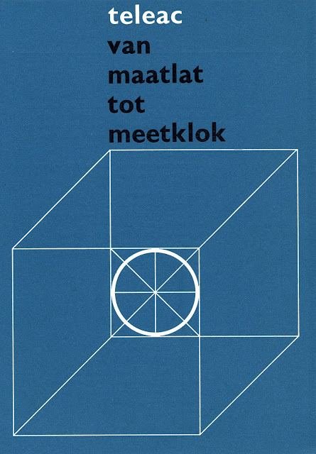
Crouwel's lines and geometric shapes are very enjoyable to the eyes.
Crouwel's famous Atelier 12 poster, imlementing simple and plain graphic design with a large sans seriff style.
This design is actually a collaboration between Wim Crouwel, Watano Shigeru and Sambeek Design.
Wim Crouwel is also famous for his logo designs, in which his natural eye for geometric shapes lends well.
The red and black circles flyer is something I've seen many many times in not just posters, but graphic design in general. Well, it looks like Crouwel started this style as well.
This is a pretty cool exhibition poster designed by Crouwel in the 50's. While it looks dated, it still has a lot of boldness to it that makes it feel unique.
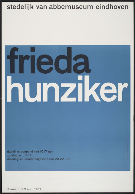
More big helvetica from Crouwel, with nice and simple colors.
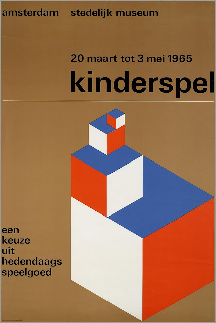
I feel like this combination of brown, orange and white is dedicated to the 50's or 60's. Upon seeing this combination of colors, it feels instantly dated to that time period. I'm not saying its not cool or not appealing, but my eyes feel that sense of "its my grandmother's old records color pallete."
Nice to see how Crouwel is the originator of many graphic design styles, including this one. Although I love Network Osaka's style as well.
I love this poster design. The way the heading feels layered and above the rest, and the division of the space, and the simple depth to it...I really want to model this for a design experiment, but with updated typography.
As it is explained in Crouwel's interview in Helvetica featured below, Crouwel plays with his letters in the form of a grid, like you can see above. The letters each are designed as spaced according to the grid, which makes for very appealing typographic design.
I also love the clarity to this one, but I wonder who was first, Crouwell or Josef Müller-Brockmann, the designer who made something very similar, see it here.
A collaborative design by Wim Crouwel and Ko Liang Ie.
I bet you can appreciate this print much more in person, just because of the paper texture and the ink detail.
When you think of instructional graphic design from the 1960's, you think of stuff like Crouwel designed above. Monotone, shaded images of people arranged in different poses. Like the Brady Bunch, or much better. Celebrity Squares could use a makeover like this.
Crouwel has done many collaborations, and here Crouwel is actually just an editor. The actual design credit goes to Ben Bos.
The lattitude-longitude globe also feels like it belongs in the 50's-70's Crouwel era. This is a pretty cool spiral book design though.
All images are found from geheugenvannederland.nl (which was down the last time I checked). Apparently all you have to do to discover great artworks is to search for the artist name, and voila, you have hundreds of artworks for your eyes to feast on.
Wim Crouwel also appeared in the documentary film Hevletica, which just got released on Blu-Ray for your HD typographic needs.
Here's a short clip of the interview with Wim Crouwel below:
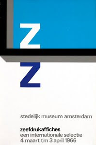
Here's a few more Wim Crouwel designs found off iconofgraphics.com
Image from iconofgraphics.com
Image from iconofgraphics.com
Image from iconofgraphics.com
OTHER CLASSIC GRAPHIC DESIGNS LIKE THIS:
Josef Müller-Brockmann

Marcel Wyss


